Overview
Lato is a sans serif typeface family that combines a warm, inviting feel with a professional appearance. Its design features a balanced structure, making it suitable for both display and body text.
Supports Latin and Latin Extended, making it useful for designs and text that handle multiple languages.
Available in Light, Regular and Bold weights, including Italic styles, Covering everything from footnotes to body text, headings, and quotations.
The license is SIL Open Font License, allowing flexible use for commercial purposes and redistribution.
Background
Lato was initiated by designer Łukasz Dziedzic during the summer of 2010, originally intended for a corporate identity. The typeface evolved into a public release, showcasing its adaptability and appeal.
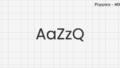
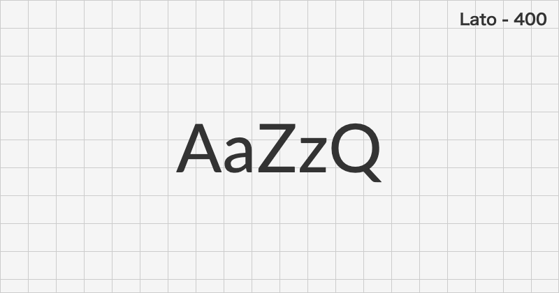
Font Sample
| Latin | Latin Extended | |
|---|---|---|
| Thin (100) | AaZzQ | ĀžČő |
| Light (300) | AaZzQ | ĀžČő |
| Regular (400) | AaZzQ | ĀžČő |
| Bold (700) | AaZzQ | ĀžČő |
| Black (900) | AaZzQ | ĀžČő |
| Italic (100) | AaZzQ | ĀžČő |
| Italic (300) | AaZzQ | ĀžČő |
| Italic (400) | AaZzQ | ĀžČő |
| Italic (700) | AaZzQ | ĀžČő |
| Italic (900) | AaZzQ | ĀžČő |
License & Author
| Commercial Use | ◎ |
|---|---|
| Author | Łukasz Dziedzic |
| Official Link | – |